In fall 2021 Testia celebrates its 30th anniversary – we take this opportunity to provide insights into the company history. In this article, we will take a closer look at the Testia logo.
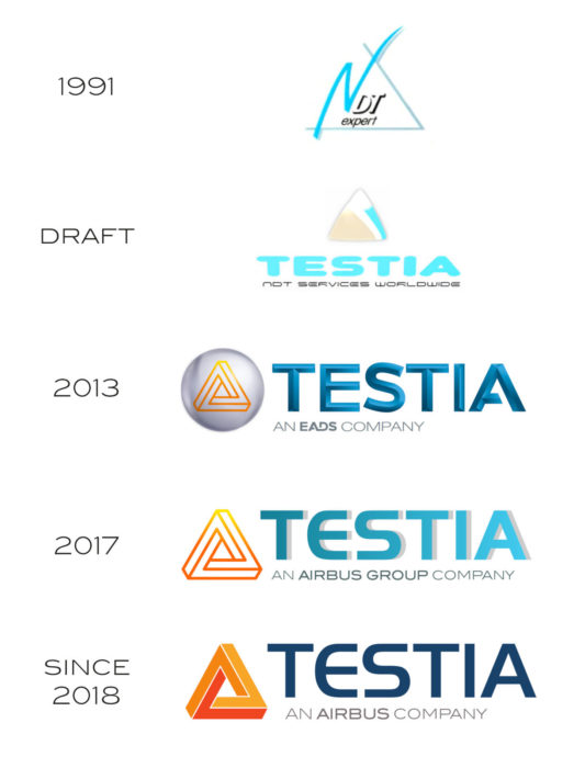
 Before Testia became the international group it is today, it started under a different name in 1991: “NDT Expert”, based in Paris (read more about this in our company history article). Even with just a quick glance at the logo of that time (top one in the image), a striking resemblance to the current Testia logo becomes clear: the triangle.
This triangle represented three service areas of non-destructive Testing, which are at the foundation of the company since its early days: inspection, training and consulting. In more recent years, the logo was adapted to represent the growing global Testia group. And Testia’s areas of service have grown as well into a diverse portfolio, covering the broad field of structural integrity, while staying true to its roots in NDT inspection, training and consulting.
Hence, the triangle was here to stay. When the Testia holding was created in 2013 and new sites in UK, Germany and Spain were founded, it was time for a new logo. From an early draft on (second from top in the image above) the triangle shape was kept as the main element of the Testia logo. It can be found in all modifications over the years, until we arrive at the current Testia logo (see bottom of the image).
Design trends and company development
The alterations that have been made to the logo over the years take changing design paradigms into account: From detailed textures and gradients, popular in the beginning of the last decade, to the timely flat design of the most recent logo.
As an Airbus company, Testia also reflects its relation to the mother company in its logo: The 2013 version incorporates the font style of the EADS logo of that time, for instance. The rebranding of EADS first to Airbus Group and later to simply Airbus was also reflected in the subtitle of later Testia logo versions.
An “impossible” triangle?
Finally: What is it about this “impossible” triangle shape? It resembles the style of M.C. Escher drawings with their optical illusions and is called “Penrose triangle”. While the graphic still represents the three original pillars of NDT Expert – inspection, training, consulting – there is much more to be found on second sight.
Just like the three edges of the Penrose triangle are linked to each other seamlessly, Testia’s areas of expertise provide end-to-end service and products for structural integrity. And even beyond that: The fascinating shape of the Penrose triangle invites you to take a new perspective every time you look at it. And in the same manner, Testia always finds innovative solutions to enrich its portfolio of structural integrity solutions and thus provide a real benefit for its customers.
